
Thank you for your time!
I thought it might be helpful for you to have all my materials available for you in one place. I have outlined how my skills, experience and qualifications meet the needs of your job posting, some examples of digital and physical campaign strategy, and other tid-bits of information you may find useful. Feel free to read at your own pace and connect with me if you have any questions.

Why Carly?
I am a sharp and driven person with a service-driven attitude. I not only want to be a great employee, but an excellent leader, and at the foundation of it all, a good person. Some of my heroes are Jane Goodall, Georgia O’Keefe, my parents, and my grandparents. I think all of these people are great examples of folks with tenacity, grace, and a quiet courage. I work hard, give with my whole heart, and lead by example.
Software/tech stack


Campaign examples
Conserv - Smart Tape Leak Detection Sensors Launch
When Conserv introduced its Smart Tape Leak Detection Sensor, I built the content ecosystem around it from the ground up — strategy through execution.
The campaign centered on education first. Museums and archives aren't impulse buyers; they need to understand a problem before they'll invest in a solution. So I started there. I wrote and designed a buyer's guide covering the full leak detection landscape, walking conservators and facility managers through the three sensor types Conserv offers, real-world use cases, and how to choose the right fit for their space. That guide lived at the top of the funnel, pulling in prospects who were still in research mode.
The product launch blog post anchored the mid-funnel, combining a formal announcement with an early-adopter incentive to create urgency without feeling pushy. Social graphics and distributor communications pushed the campaign out to Conserv's existing network, meeting audiences where they already were.
The result was a cohesive, multi-touchpoint campaign built for a niche audience with long consideration cycles. This is the kind of content marketing that builds trust over time and earns the sale.
Assets produced: Educational e-book, product launch blog post, social media graphics, distributor outreach materials

Click Image to view and read blog post

Click Image to view and read the ebook PDF
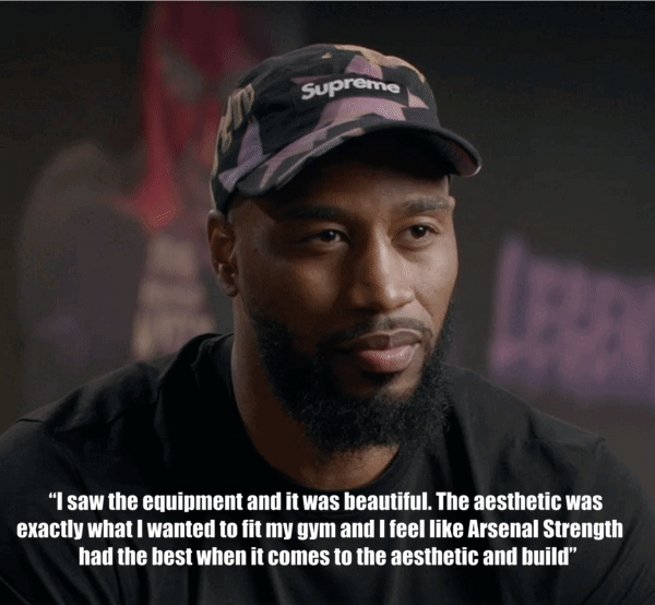
MPower6 x Arsenal Strength
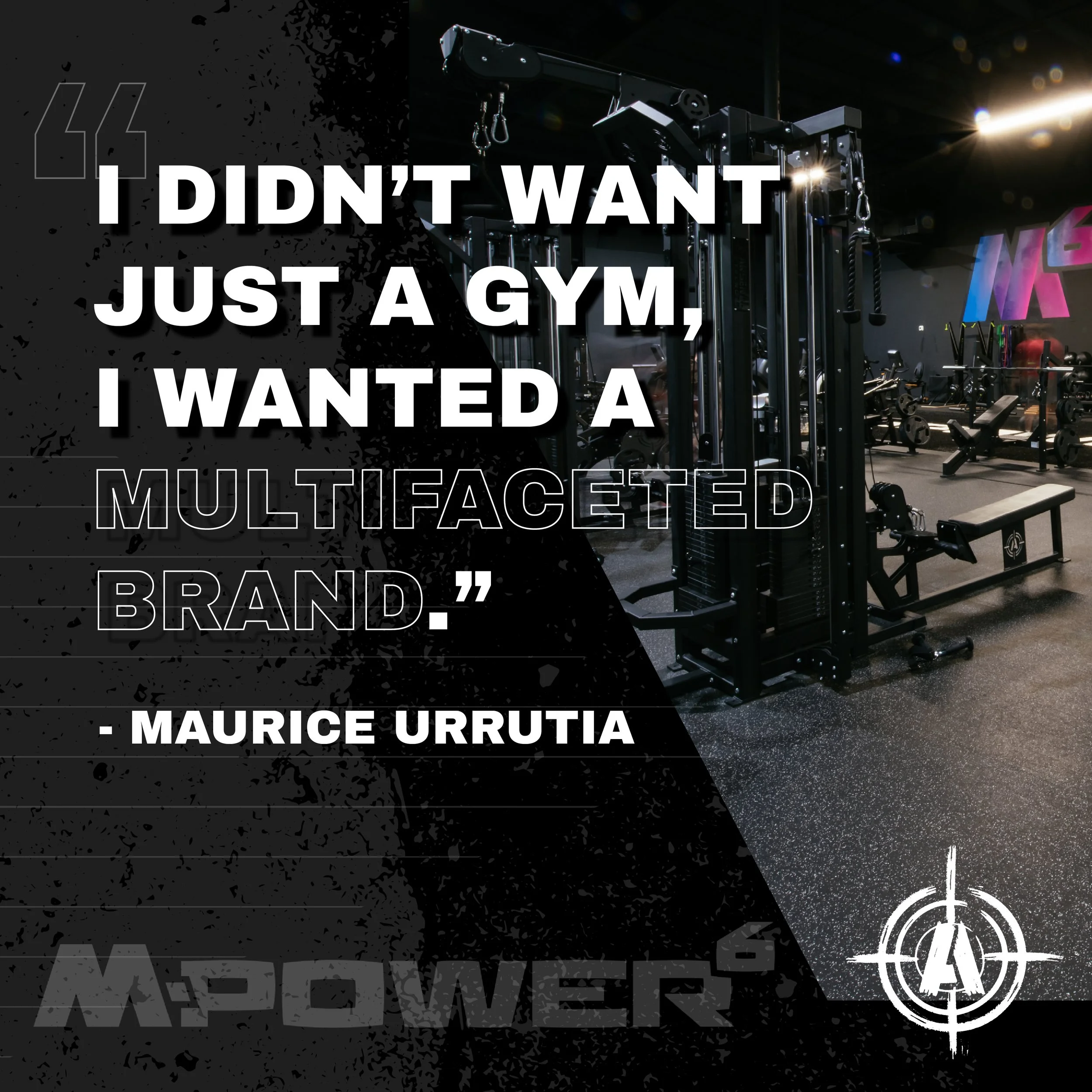
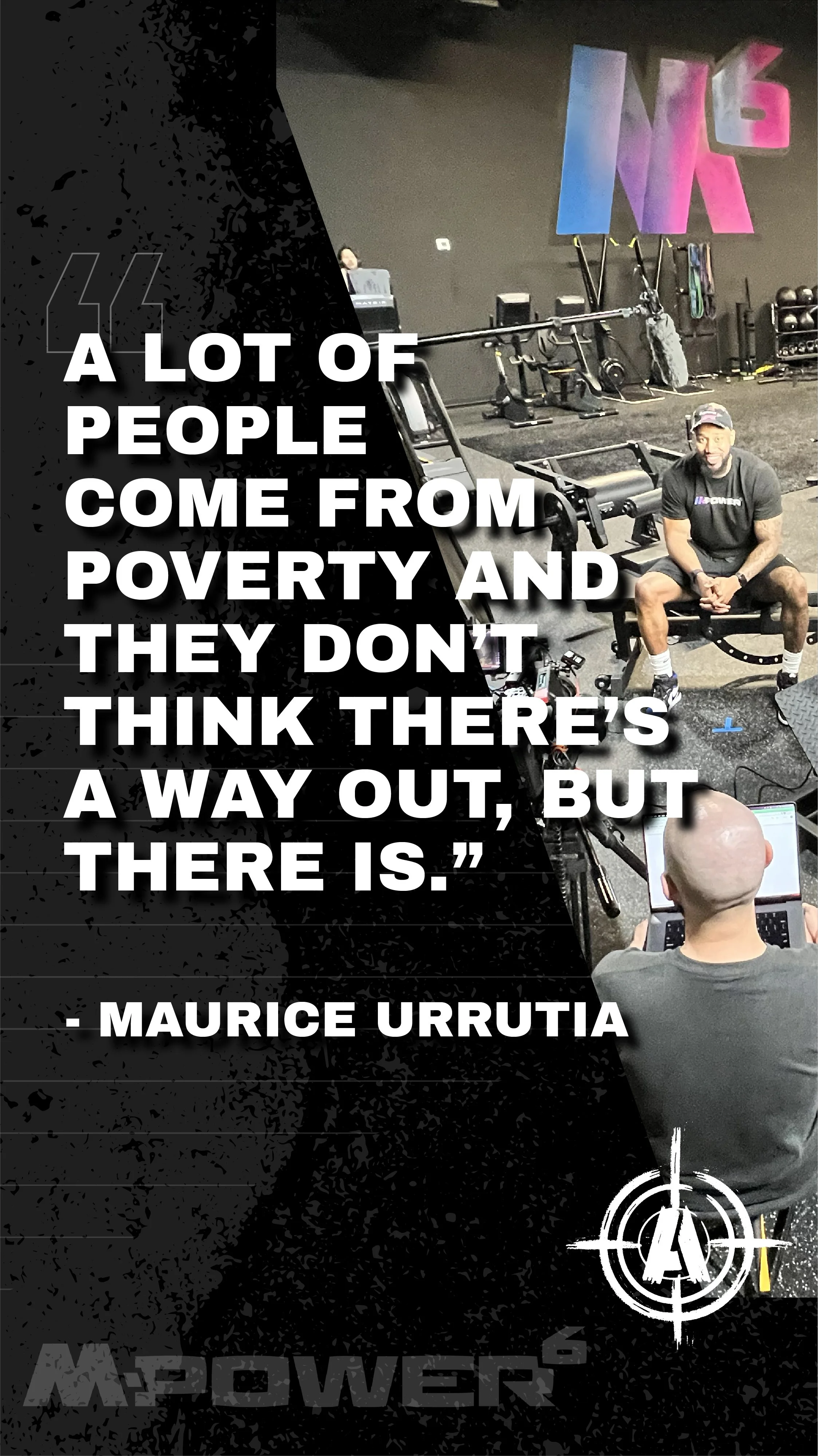
This is of an example of storytelling for our gym design sales process. Through working with this customer, I learned about his story and wanted to share it to give inspiration to others like him who may want to start a gym. We created a two part series to highlight Maurice’s inspirational story and to show how we helped him build a gym that made his dream a reality.
Part 1 - Business Goals
Part 2 - Maurice’s Story
Part one outlined Maurice’s goals for his business and how he wanted to build is brand
In part two, Maurice shared his emotional journey of how he overcame adversity to pursue his dreams.
Since Arsenal Strength works with such passionate and strong personalities, I wanted to reach out to them in a personal and inspirational way.
Goals: Long term brand awareness and to provide an example for our sales team to reference when speaking to prospective gyms owners.
Results: these videos were viewed over 1,000 times on youtube, and cutdowns were viewed over 14,000 times on instagram. We saw a 117% increase on new quotes in the 4 days following the publication of part one’s publication and a 108% increase on new quote requests in the 4 days following the publication of part two.
Video Production Company: PopFizz, Knoxville, TN.
Social media assets
Example of a static image to use for hard posts for Instagram and Facebook
Designed to be used for X (Twitter)
Instagram Story we posted in the days following the publication of the video
Ober Gatlinburg - “Check Everything off your Smoky Mountain Vacation List”
In 2021, following the peak of the pandemic's impact, the leadership at Ober Gatlinburg requested a branding refresh with a campaign to push it out into the community to make sure everyone knew we were open and ready to receive visitors. The leadership had several requests:
To keep the iconic typography and snowflake that was created when Ober Gatlinburg was founded in the 70’s.
To have a visual representation for the seasons: spring/summer, fall, and winter.
To have more emphasis on “Ober” since this was how the community often referred to the ski area and amusement park
Results:
I created a layered representation of the logo including a colorful mountain range that could be changed for the seasons (green for spring/summer, orange for fall, and blue for winter) and a translucent snowflake so that the emphasis would be more on the word “Ober.” This allowed it to be more easily recognized in brochure racks and on billboards.
Lessons learned:
While the leadership was happy with the design, I do find this design to be a bit “busy.” We ran this version for a year including all three of the color variations for the seasons and saw record numbers of customers who were overall happy with the brand representation.
Campaign concepts
We played on the idea that people have a checklist when visiting the Great Smoky Mountains and that many of their desired activities could be “checked off” by coming to Ober.
We pushed this out to the public with
A 16 page full-color brochure
Google Display Ads
16 billboard faces. Some were designed for longer read times in areas where the viewer might be stuck in traffic, and others were designed for shorted read times when they might be farther away and foing faster down the interstate.
Social media organic and paid content


Conclusion (for now!)
Please do not hesitate to reach out to me with questions or if clarification is needed.